

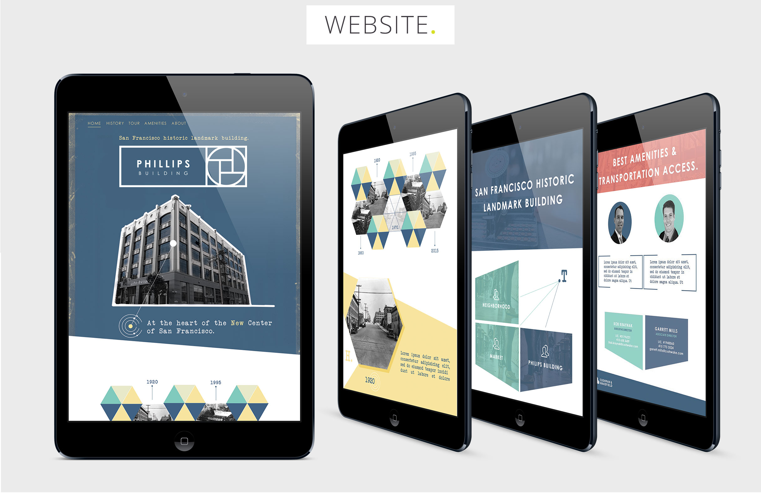

For the launch of this new building property based in downtown San Francisco, I developped a cutomized design system focused on a digital tour on Ipad introducing unique features and amenitites around the location.
- Brand system
- Website
- Email campaign
Typography should feel contemporary with clean lines and simplicity but with a vintage flair and composition.
The overall look should feel vintage but have a modern edges and shapes.
Photography could have a texture treatment to make it feel more hand-made (tactile) to get a feel like film or paper.
The tone of the messaging should address the building as having a unique San Francisco identity. Copy writing and tagline should have some nostalgic levity without compromising quality. It should hit the key values of the Phillips Building.